

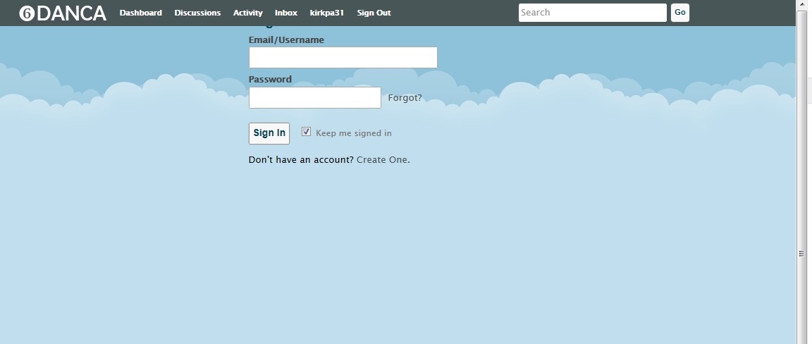
Entry Screen - Cut Off At Top
 kirkpa31
✭✭
kirkpa31
✭✭
Included is a screenshot of the situation: Both this entry screen and the "Apply for Membership" screen are cut off so that you can only see the boxes, not the titles. Here you can see the faint bottom of a "g" for Sign In. What is the fix for this? I've been playing around to no avail with css.
0
Comments
use firebug, for that text sign in and add margin-top:40px to its class perhaps
@kirkpa31
the problem is with the Body , you must change it to this to move it down in the custom.css of the theme.
#Body { width: 960px; text-align: left; margin: 50px auto 55px; }Worked great @vrijvlinder. Thank you @422 as well!